"Top 10 monospaced fonts"
"Top monospaced fonts for coding"
"Top 10 programming fonts"
...and so on.
Sure, everybody has a personal ranking they like best, but all those lists seem to focus too much on sans-serif typefaces. I am aware of generally accepted claims that "sans-serif are considered to be legible on computer screens"[WP]. However, likewise, "serifed fonts are overwhelmingly preferred for lengthy text printed in books, newspapers and magazines", and, "Recent introduction of desktop displays with 300+ dpi resolution might eventually make this recommendation [for Sans Serif] obsolete."
So let's have a look at some underrepresented fonts. At the end, I also have some geometric sans-serif fonts you also normally do not get shown anywhere.
Serif
Computer Modern
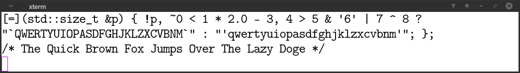
This is the font you may encounter in all the scientific papers. Wikipedia says on the matter: “[It] exemplifies Knuth's desire to return to the glories of classic metal-type printing.”
In openSUSE, the package is called cm-unicode-fonts, the font name is CMU Typewriter Text.
Century Schoolbook Monospace
Mx437 DOS/V re. ANK30
CJK workstations always needed something better than 8x16 fonts; but in doing so, they often came with serif fonts. This is one of the largest bitmap fonts (in terms of vertical size per cell) of those days — any larger and you would get into vector territory (e.g. MS Mincho). It is downloadable from int10h.org.
Xanh Mono
Its “Regular” variant is rather thin, so this example features the Bold type. The serifs are quite eccentric (rather long), while the punctuation glyphs like tilde, comma, etc. are uncanny small.
Sans Serif
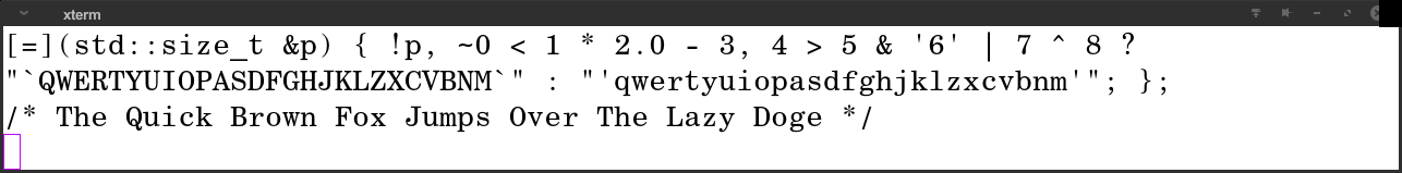
Fira Mono
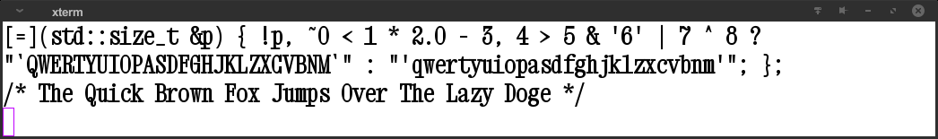
Lucida Console
This font from the Windows corner uses wide bulbous strokes, and characters fill their individual bounding box almost completely.
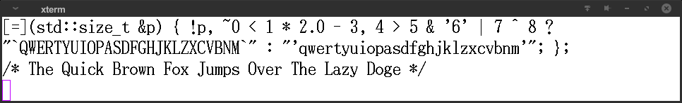
Monaco
This is the font from MacOSX. The hinting codes inside the version I have allows for two possible renditions, a normal one and one where strokes have a bit of a chisel tip appeareance:
NK57 Monospace
A font similar in spirit to “Eurostile” or “Microgramma”.
Source Code Pro
The spacing is unusually wide.. otherwise it's just your typical sans serif font. (Configuration depicted here: matrix=1.5 0 0 1.7; the letters are generally a lot wider.)
Ubuntu Mono
The one with all the rounded legs.
Text Console Galore
Need a native DOS/80s look? Look no further. int10h.org has a huge collection of these, so head over there now.
Characteristics of the x86 ROM font (family) are:
- Medium weight. Stem thickness is about 23% of the character box width.
- Ample spacing within the glyph.
- Horizontal strokes are about the same weight (owing to hardware limitations of then, it is 67% of vertical strokes).
- Opportunistic serifs. Serifs are present where there was room (cf.
glyphs for E, T, Z), and left out elsewhere (like W, H).
IBM VGA 9x16
IBM VGA 8x16
IBM EGA 8x14/MDA
ATI 9x16/8x16
Verite 9x16/8x16
The Uncategory
OCR A
The font used on credit cards. I do not expect anyone to survive coding sessions on this one for very long, but after all, this list is about variety.
OCR B
Notes on converted bitmap fonts
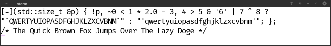
Back in the old days, the typical screen ratio was 4:3. With 80x25 characters on screen, the characters had a ratio of 5:12. With 9x16 pixels per character (VGA text mode), the pixel ratio was therefore 20:27 (0.74). Some of the Mx437 may need to be stretched/compressed accordingly to get the exact same feeling. If you are the lucky user who has available both the FreeType renderer and the "xterm" program, doing so on-the-fly is easy:
xterm -fa "Mx437 IBM VGA 9x16:matrix=0.74 0 0 1"