Terminus is a square geometric font by D. Zhekov and contributors. The SourceForge project listing was established on 2010-06-30. The font comes in a versatile range of different bitmap sizes and weights. This makes for slightly different looking (and thus unique) variations.
The Consoleet project provides OTF vector versions of all those sizes and weights, both with traditional jagged edges and smoothened diagonals (using N2 vectorizer from vfontas). The N2-Smooth variants do not exist for all sizes or weights, because the N2 vectorizer needs glyph stems to be at least two pixels wide to produce a (meaningful) result, which is not the case for the small or thin fonts.
Archeology note: VileR pointed out a historic IBM font package by the name of HOWARD The Font 3.61, which contained neil14.fnt, neil16.fnt. Terminus-14/16 looks has a similar square-geometric look and some sharp edges (cf. C,D,M,W glyphs), but is ultimately subtly different. neil12 and Terminus-12 however are quite unlike each other.
Download
- Latest release from Consoleet: 4.49.1 (2022-09-20)
The version number follows that of upstream.
DL: consoleet-terminus-4.49.1.tar.zst - Some Linux distributions may have a readily installable package (e.g. openSUSE's consoleet-terminus-fonts)
- Release archive
Screenshots
- Comparison between
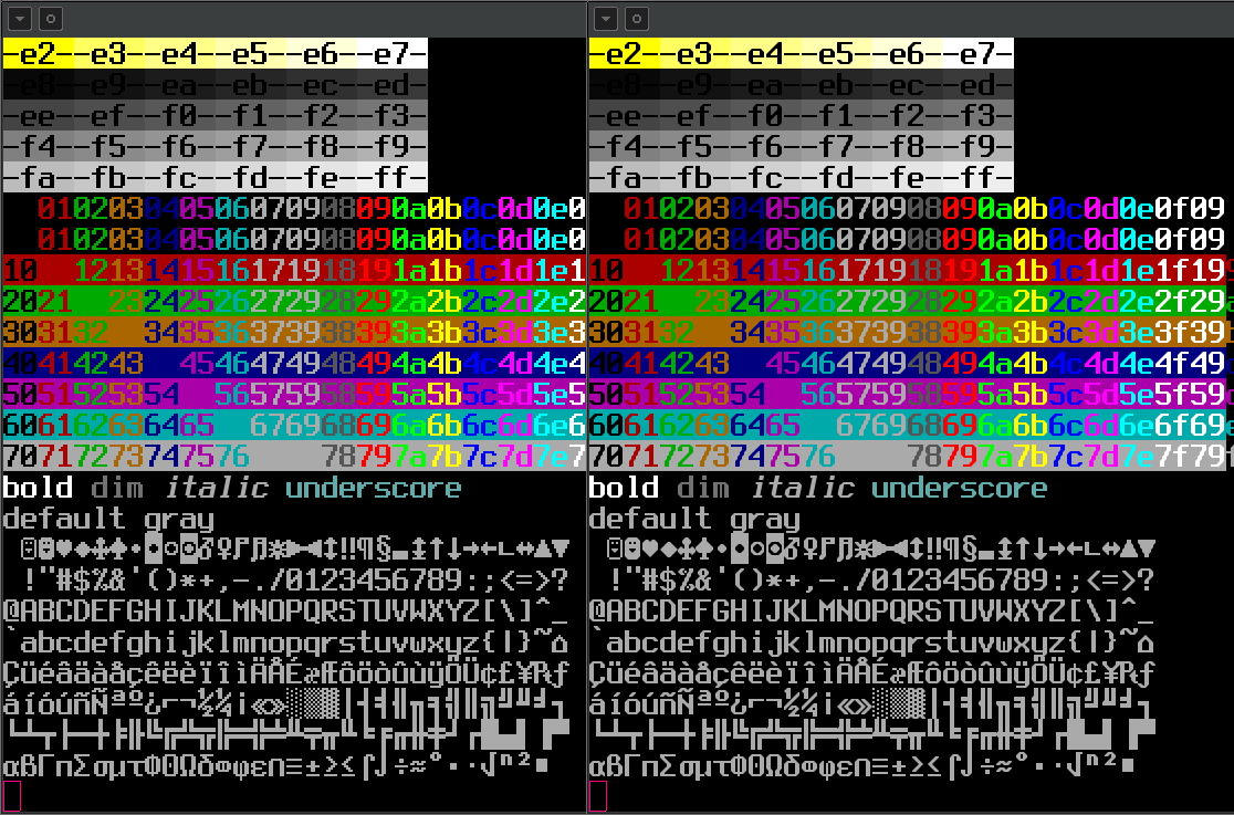
Consoleet Terminus-14(which is the original font with its jagged edge look, and put in an OTF file) andConsoleet Terminus-14 Smooth(where short-step staircase edges have been smoothed out using vfontas's N2 vectorizer, and put in an OTF file) rendered with 21pt@96dpi.
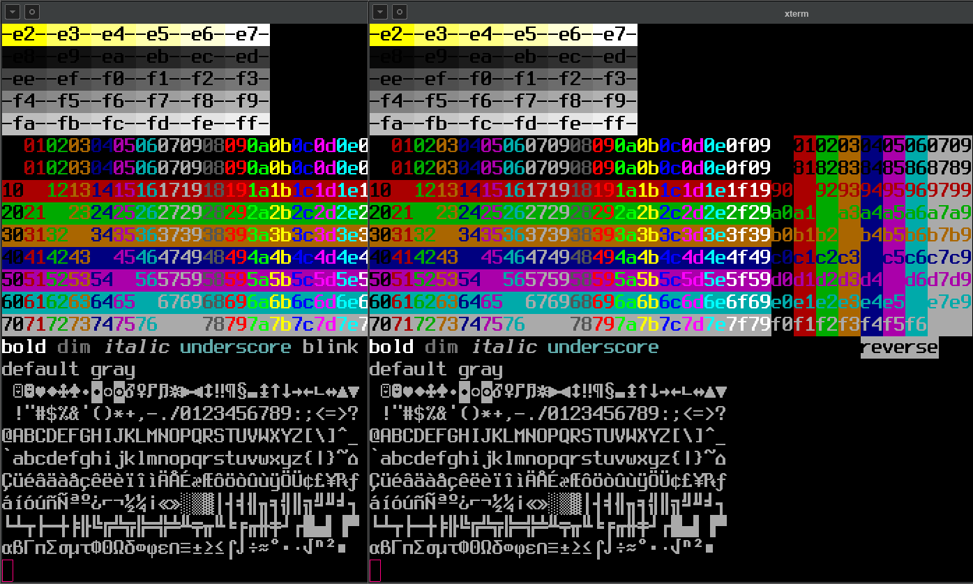
- Comparison between Normal and Smooth versions of Terminus-16 Bold 24pt@96dpi
- Comparison between Normal and Smooth versions of Terminus-18 Bold 27pt@96dpi
- Comparison between Normal and
Smooth versions of Terminus-32 Regular at 48pt@96dpi
- Comparison between Normal and Smooth versions of Terminus-32 Bold at 48pt@96dpi
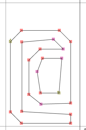
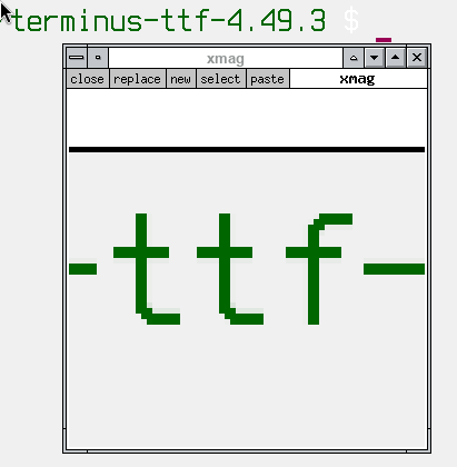
ax86 variant critique
ax86 (T. Blumenbach) has produced vector versions of Terminus. However, these look absolutely atrocious due to weird orientations of outline segments. It is an inherent property of the potrace program to treat features smaller than 3 (or so) pixels like that. For example, see this outline for the AT sign in ax86-terminus version 4.49 (4.49.1?):
The Consoleet OTF versions do not have these problems — segments are always on a multiple of 45°.
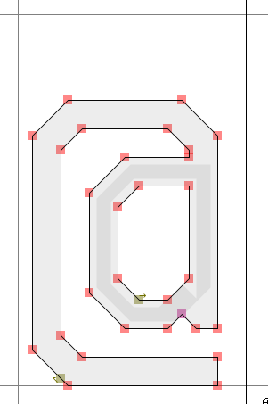
In ax86-terminus version 4.49.3, pre-upscaling was employed as the well-known go-to workaround for potrace's behavior. However, upscaling suggests to potrace (or any vectorizer for that matter) that there is an "actual" staircase and not one that merely exists because of low resolution. As such, ax86-terminus lost all diagonal edges. Which, I guess, is ok in principle, because jagged edges can also be seen as an integral feature of bitmap fonts - I personally like using my DOS-esque bitmap fonts in non-smooth form as well.
But ax86-terminus 4.49.3 still suffers from potrace's effects, which is: Even though the lines are now 90°, they still are not aligned with the pixel grid.
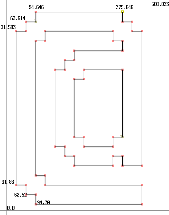
Right image: coordinates relative to the lower-left corner of the bounding box (mockup)
The glyph is 500 units wide and 1000 units high, with the ascent part being 813 units tall and the descend 187 units. Note how 20/52/83, or 187/207/239/270 are not evenly divisible by 16 (original bitmap glyph height), or how 31/62/94 are not evenly divisible by 32 (original width), so you are also guaranteed to get (ever-so-slightly) antialias in both directions at pretty much every rendering size.
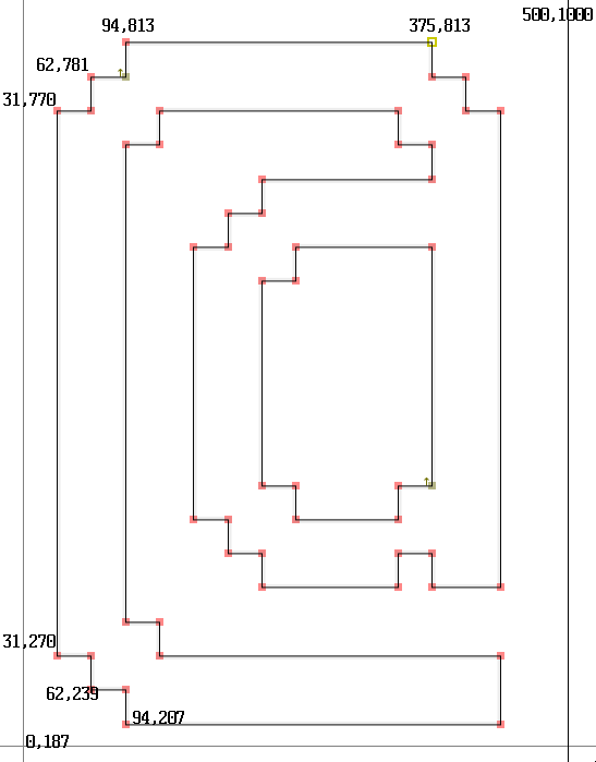
The Consoleet OTF versions do not have these problems — all segments are always on the right coordinates that are divisible by the original bitmap glyph size.