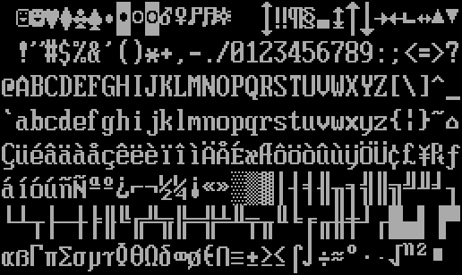
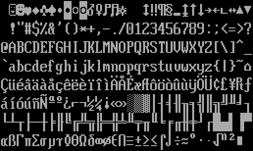
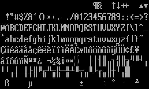
Film (like, for movies) originally had an aspect ratio of 1.33 (4:3), and this carried over to TVs and computer monitors. The image would generally be projected onto most of the screen, and if something was not to one's liking, the image could be adjusted with some knobs. Such stretching could be performed irrespective of the resolution emitted by the video card, and so, the knob(s) effectively changed the pixel aspect ratio (PAR).
The centerpiece of discussion here is the 80×25 text mode (mode 0) of VGA-class hardware, which outputs a 720×400 image.
Some rescaling will be needed
Projecting this onto a 4:3 area, you arrive at a PAR of 20/27 for the cell. LCDs have a fixed PAR (generally 1/1). Showing content intended for a different pixel aspect ratio leads to some issues. 1. Uncorrected content appears stretched. 2. Re-stretched glyphs do not produce pixel-perfect output if the factors of the target resolution does not match, lest you get rescaling artifacts. 3. The smallest thruthful representation of a correct glyph cell on a 1/1 LCD would be with 180×432 pixels, so one would need a 10K display (14400×10800) for a window of 80×25 text. Displays like that practically do not exist.
Do rescaling artifacts (usually antialiasing, e.g. smudging) matter? Only to some extent. 20/27=0.74074 is an awkward number, and we can “cheat” by just pretending it is 3/4=0.75. Then, a 2160×1600 display will suffice. But 1920×1080 displays are still popular. Could one live with the scaling artifacts? Certainly, and using 0.75 is useful in that regard: every fourth pixel edge in the horizontal direction is sharp (which is better than no edge being sharp I guess).
CRT monitors have their own artifacts owing to the shadow mask. Examination of digital photo captures of CRT screens suggest that 720×400 original image could be reproduced on LCD with 2880×2160 pixels (in other words, a 4K monitor).
Start a font from scratch
One can either live with scaling artifacts, or… make a new font which trades exact lookalike against a design targeting a 1:1 PAR.
The cell of 9x16 has a rendered aspect ratio of 20/27, but what matters more is the apparent aspect ratio of a typical glyph like 'M', which is 7×10*20/27=0.51. These values set the stage for developing a font alteration.
By taking the VGA font and elongating the glyph legs by adding some pixels, we arrive at two real-world examples:
Toshiba's 7×11
Toshiba machines had various LCDs, common were 640×480 and 800×600 (T3400 (1991) and 220CS (1996)), and there have been (for the time) unusual widescreen resolutions like the Libretto's 800×480 or the Portege 300CT's 1024×600. They showed 80×25 textmode with 8×16-sized cells, and the resulting 640×400 image was presented unscaled and centered in the screen. There was also a Stretch mode in the firmware. Sometimes, there seemed to be no/litle stretching artifact and sometimes there are hints of blatant Nearest Neighbor upscaling. (1)(2) The ROM font from the C&T Chips and Technologiges number 65554 chip is available in the int10h fontpack under the name Mx437 ToshibaSat 8x16. As said, the cell is 8×16 and the glyph core is 7×11px (aspect 0.63), making this font look comparatively tall over IBM VGA 9×16).
AST/UEFI 7×13
Second is a AST/CirrusLogic product such as the AST PremiumExec 386. I only have Internet images and videos to go off by, but it looks like it shows the 80×25 textmode with 8×19-sized cells. The glyph core is 7×12px (aspect 0.58). Perhaps they should have gone with 7×13px to reach 0.53, but there are some artistic constraints (and freedoms) everyone has got to bear/enjoy.
8×19?! Well, 8×19 multiplied by 80×25 textmode produces a 640×475 image, which fits nicely onto a 640×480 display, leaving just five unused rows of pixels.
Anyway, it is fair to say that 8×19-cell fonts were rare. VileR's int10h.org only lists two 8×19 fonts in his database — and he surely has seen more hardware than me. The third 8×19 font to appear was around 1996 on certain Intel boards, which later would find its way into the Sun Microsystems x86 server lineup (e.g. the X4140), and then desktop motherboards, when UEFI started proliferating post 2006.
- Mx437 CL Stingray

- Mx437 AST PremiumExec

- Consoleet UEFI aka LaffStd (probably for Latin Fixed Font Standard)
